Case Studies
These are some of the biggest and the most challenging projects I've executed so far. I've tried to present them like case studies so it gives you a better idea of what happened, how I contributed and how it turned out. I know you're seeing a lot of text, but trust me I've written it is sections so you won't get bored and get your answers.
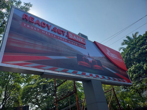
SIB Trust Meets Tech
How It Began
What should've been a regular EOD turned into a “drop everything, we need a teaser campaign by tomorrow morning” situation. SIB was about to launch a brand film built around an F1 theme, and they wanted an internal teaser that felt fast and more importantly was delivered fast.
My Role
I jumped in on the copy while teaming up with our Creative Director on the visual approach. The goal was to match the F1's sporty and fast feel to the brand's professional and trusting image without losing the brand's tone and voice.
What I Did
-
I wrote multiple copy directions as options that bridged racing adrenaline with banking efficiency.
-
I collaborated on the visual treatment so the message and design didn’t feel mismatched.
-
I framed the campaign’s core idea to make the F1 metaphor actually meaningful rather than decorative.
What Happened Next?
The mailers were approved on the first draft! A rare enough feat to deserve fireworks. We got an appreciation mail where I got a special mention from the client for the copy, which led us to work on the next leg of the campaign, the teaser video and the outdoor hoardings.
The hoarding concepts got approvals too and we wrapped the campaign faster than it takes for an F1 pit-stop.
The Final Lap
A high-speed project, tight timeline, sharp execution and MY FIRST OUTDOOR CAMPAIGN! I had a lot of fun working on this.
AU Instapay Credit Card
How it began
AU Small Finance Bank was preparing to launch a brand-new credit card, one that would allow customers to make UPI transactions directly through their card. This was the first ever UPI Credit Card, and they wanted the launch to feel bold, fast, and modern. We had to coin a utility-driven product name, design a credit card, a master creative and a launch video that got added on post locking in the master creative.
A full 360° branding package, but with a single clear promise: speed + upgrade.
My Role
I was responsible for the naming, visual concept route, and core creative direction that shaped the identity of the product. I was leading the ideation for product nomenclature, conceptualise the card's visual and create the foundation of the launch communication.
What I did
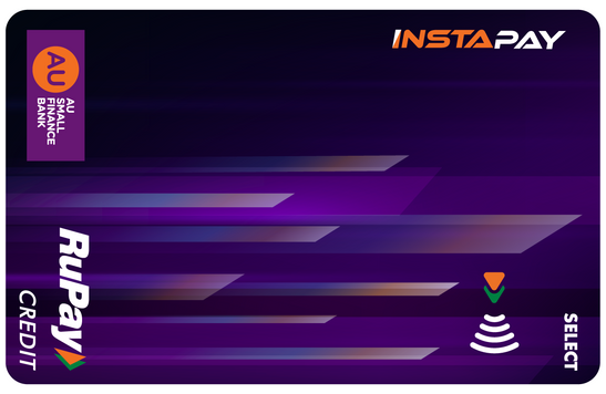
The name needed to be functional, intuitive, and immediately tell the user what the card does. That ruled out clever wordplay and pushed us toward clear utility. So I coined the name “InstaPay.” Short. Fast. Says exactly what the product enables: instant payments.
For the card design, I wanted something that visually communicates speed, tech, and upgrade in one frame. That’s what led me to the Flash’s iconic sonic trail which is a striking visual metaphor for velocity and constant forward motion.
What Happened Next
The name and design direction clicked immediately with the internal team and the clients as well. Once approved, the InstaPay identity became the anchor for the master creative and the event launch video. The product team used the visual system we built as the basis for all subsequent communication.
Final Thoughts
This project was a rare mix of strategy, identity building, and storytelling, the kind where one strong idea sets the tone for an entire product launch.
AU Traverse Credit Card
How It Began
AU Small Finance Bank was building a new premium, travel-focused credit card and needed an identity that instantly communicated movement, exploration and a sense of upgrade. The brief was simple but high-stakes: find the right name and set the creative direction for how the card should look and feel.
My Role
I contributed to both the naming and the conceptualisation of the visual identity, shaping how the card would present itself as a high-value travel product.
What I Did
I proposed the name “Traverse” because it carried the right energy—short, elegant and strongly associated with journeys. For the design direction, I developed a visual narrative built around a deep blue premium base, a gold line-art world map and a single flowing route line that ends in a paper-plane motif. The idea was to create a sense of continuous motion and global access without crowding the card with unnecessary elements. This direction helped set the aesthetic foundation for what became the final look of the product.
What Happened Next
The Traverse Credit Card was launched as AU’s dedicated travel upgrade, and the combination of the name and the creative direction supported its positioning as a premium lifestyle offering within the bank’s portfolio.
Final Thoughts
Traverse is a perfect example of how subtle decisions in naming and design can turn a financial product into something aspirational. Even with minimal elements, the right story can elevate a card into a lifestyle identity

SIB Fin-A-thon
How It Began
South Indian Bank planned a hackathon at IIT Delhi with cash prizes and job opportunities for the winners. The brief was simple: build awareness, drive registrations, and make the event feel big enough to attract serious talent.
My Role
I handled the identity and the entire digital communication. From logo direction, launch video, website creation, content framework, to the social + email marketing plan.
What I Did
I created a visual identity that matched the energy of a tech-driven competition and used it to anchor the launch video and all further communication. Then I built a content calendar that rolled out information strategically communicating the event details, prize highlights, reminders, and conversion-focused posts across social and email channels.
What Happened Next
The digital push delivered. Social channels alone brought in 500+ registrations, contributing significantly to the total 1650 participants, as shared by the client.
Final Thoughts
Fin-A-Thon proved the impact of sharp positioning and consistent communication. With the right identity and content rhythm, we turned a college event into a high-engagement recruitment platform for SIB.
SIB Kerala Diaries
How It Began
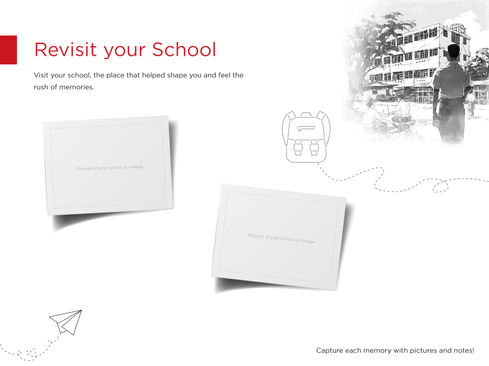
South Indian Bank wanted to make the upcoming festive season more meaningful for returning NRIs. Every year, thousands come home to Kerala to reconnect with family, food, and cultural roots. The idea was to give them a homecoming booklet—something they could fill with photos, moments, and memories from their trip. Along with being a warm engagement piece, the booklet also needed to subtly promote SIB’s NRI services.
My Role
I was responsible for shaping the theme, creative direction, nostalgic tone, and the initial visual style for the booklet, ensuring that both the emotional and promotional aspects blended naturally.
What I Did
The audience was largely NRIs in their 30s and 40s, people who grew up with Doordarshan-era comics and stories that felt simple, warm, and distinctly Indian. To tap into that emotion, I rooted the entire booklet in the visual language of “Malgudi Days,” a style already associated with comfort and nostalgia.
To build this world, I used MidJourney to generate Kerala-inspired illustrations in the Malgudi Days sketch aesthetic. Once the perfect cover and style direction were locked, I reused the same seed number so that the rest of the visuals created by the art team stayed consistent throughout the booklet.
What Happened Next
The concept resonated instantly. The nostalgic theme captured exactly what the booklet needed to stand for. A homecoming, memories, and cultural familiarity. With the visual style locked, the asset moved quickly into production. This cohesive direction allowed the client to extend the theme across activity pages, photo sections, and promotional elements for their NRI services without breaking the emotional tone.
Final Thoughts
This project taught me how to weaponise an emotion and strategise around. By combining cultural insight with AI-assisted illustration and thoughtful storytelling, we created a keepsake NRIs genuinely enjoyed taking back with them.


